There is no successful company in the world that doesn’t have a logo. Here you’ll learn exactly why your logo is so important and how to create one.
A Logo Paints a Thousand Words
We’ve all heard the phrase “A picture paints a thousand words.”
Well a logo can say more about your company than that, so it’s crucial that you get it right. Your brand image can, like a first impression, be won or lost by your logo.
Who Doesn’t have a Logo?
Can you name a well-known brand who doesn’t have a logo? I thought not.
If you have a logo that projects the right image it will give you a huge boost to your chances of attracting the right customers.
Just look at some of these top firms.
Activity Village specialises in colouring pages, kids crafts, educational resources, puzzles etc and their logo represents their target market perfectly.
It has a child like quality to the typography using crayon like colours and a higgledy-piggledy style as if written by a youngster.

So how do you create a knockout logo?
Everything you Need to Know to get a Great Logo
Here at LogoMax we can show you all you need to be able to design the logo that’s right for you. We’ll show you how to define your company’s identity and give you an understanding of what makes a great logo.
First Steps to a Great Logo
First, you’ll need to get your head around why a logo is so important, and get your creative juices flowing. Having a look at other company logo’s in your industry is of course a great place to start but if possible, you want something that stands out from the crowd.
Attracting new customers is hard enough but it is even tougher to get the right sort of customers. You need ones that will stick with you.
Your logo is often the first thing any potential customer sees, so it must spark their interest.
You owe it to yourself to have the best logo you can get, because that first impression is crucial.
Across all Platforms
Everything that represents your company should match and all portray the same brand image. Your Website, Twitter profile, Facebook page, Pinterest and Instagram accounts. Following on from that all stationary, such as letterheads business cards etc should all be on brand.
Check out for example of this company here: CheaperCover
Starting off with a fantastic domain name for any insurance related business such as; Car Insurance, Home Insurance, Medical Cover, Breakdown Cover etc etc.
CheaperCover built on that with a simple header graphic that basically just underlines the name. Though to be fair with a domain name that good you’d want to highlight it!

The logo couldn’t be simpler, just CC using their colour scheme.
See their Twitter Profile here: @cheapercover

Their Website here: www.cheapercover.com
Ideas for your Logo
What is your business all about, what is its unique selling point and what does it stand for? What demographic are you trying to appeal to? Can you sum up your companies’ mission in a handful of words?
If so, you should be able to get some inspiration for your logo design.
Starting with a blank piece of paper is so tough and coming up with something fresh and new is not something everyone can do. Get staff and or friends and family to help you have a brainstorming session.
There is no such thing as a bad idea in a brainstorming session nothing should be off limits just fire ideas out there. I prefer a flip chart or a white board and let everyone write down single words on post it notes and come up and stick them on the flip chart.
Just get a conversation going and you may just spark some ideas off each other.
Opposition Research
If you are struggling for inspiration check out all the successful brands in your niche and see if that can spark some inspiration for you. You should want to be different so look at the competition with a view to trying something a little different.
Once you have a clear idea of your brand and are feeling inspired, it’s time to start translating that into design.
The Long Game
Be careful of going for something that is “of the moment” that may look good or have a catchy strap-line with a reference to the latest popular culture trends. Logos like that have a very short shelf life and rarely age well.
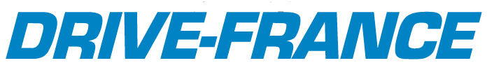
Less is More
Brands often choose a clean and minimalist style. Just look at this simple “Text Only” logo from the Drive-France website.
Drive-France is a specialist website that has become an authority on driving and motorcycling in France. France is the most visited country by UK tourists mainly due to its proximity and beautiful countryside and beaches. Skiers are also attracted to the excellent French winter ski resorts.
People can easily drive their own cars or motorbikes over on one of the frequent ferries or use the Eurotunnel.
Bikers organise road trips and take their motorcycles and tour around France. Even without Paris and Disneyland Paris there is so much to see and do there.
Many people who lost relatives in WW2 visit Normandy each year to commemorate the D-Day landings.
Sun lovers head down to the South of France for the wonderful beaches.
The Drive-France website uses the plain text logo but also a photo of a Citroen 2CV, which is typically French, to instantly convey what the website is all about.
The Drive-France logo is simplicity itself using the company name as the logo. The only thing they needed to work on was making sure it had recognition value, with clever use of typography.
When your Domain name is such a strong “Keyword” and on brand then putting it front and centre is a clear advantage.
Pictorial or Logo Symbols
If you think of the McDonalds M or the Starbucks logo there are no words on it just hugely recognisable brand images.
If you are going to just use an image or symbol, then make sure it is clear to see and easy on the eye.
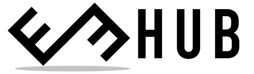
EE Hub the Business Enterprise Blog has a nice clean simple logo.
As a start-up or small company, you’d be wise to use an image together with a Text logo (wordmark) in the early days.
If your brand gets bigger and more well known, then you’ll be able to drop the wordmark.
Mascot Logos
If you want something fun, then a brightly coloured Mascot logo might be just the thing for you. Maybe not if you’re a law firm or chartered accountants but yes if your brand is trying to attract children and the parents of young children.
Logo Colour is Important
Colours can imply many different things and can play on people’s psychology without them realising.
Red can signify passion, excitement or anger. It often commands attention. Orange can suggest vitality or playfulness and so on.
A colour wheel can help you decide which colours work well together if you are having more than one.
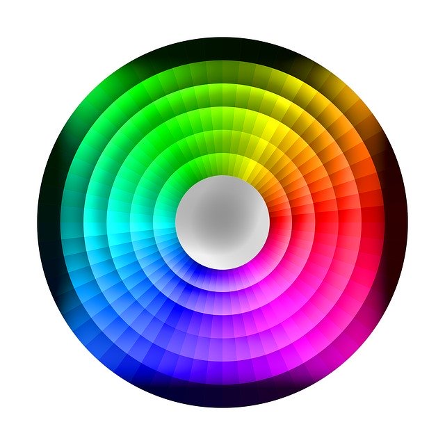
Use the wheel to identify how colours relate to one another and it can give you guidance on the relationship between primary, secondary and tertiary colours.
Basic colour theory is if you are using two colours then choose two opposite each other on the colour wheel, and if opting for three then choose three equally spaced out on the wheel to form a triangle.
It is advisable to carry out more in-depth research about colours before making your final decision.
Company Name
The name of your company has a big influence on the logo. If your company name and is very short like for example the SEO company “Ditso”. Then that does give you certain advantages when it comes to logo design.
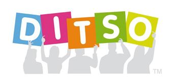
Ditso uses a great colour themed logo that helps to show them bringing a crowd of people together via their Social Media Management Service.
Find the Right Font
Font (typography) is another important decision to make. It should complement your logo shape and design.
There are dozens to choose from and some of our favourites include.
Bebas Neue, Montserrat, Roboto, Nexa, Exo 2, Raleway, and Sans serif.
Keywords are Good
Take a look at this Headlamp Converters website. They have the most basic header graphic on their website, I wouldn’t even call it a logo. However, because they own the domain name which is their number one keyword in their niche, they can keep it simple.

Headlight Beam Converters are mainly used by their UK customers who are legally required to alter the beam on their cars headlights when driving throughout mainland Europe. They drive on the right-hand side of the road on the continent and UK headlights (which are set to point to the left) would dazzle on coming vehicles.
Logo Contests
It is fairly easy to run a logo design contest and that way you can get lots of ideas and pick the best.

The Motorhome Depot based in the West Midlands did just that and for next to nothing were able to get the ideal logo for them.
They gave a creative brief and provided a link to the website so the potential designers could get a good idea of what they were after.
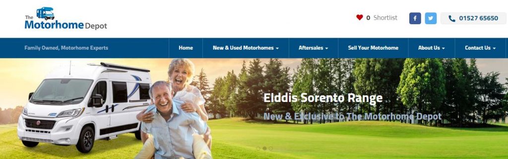
The Motorhome Depot were an existing motorhome dealer offering a huge choice of both new and second-hand motorhomes for sale in the UK.
Their family run business has huge expertise in the field of campervans and motorhomes of all types.
So they are able to really guide potential customers through the options available to them, making sure the customer gets the right Motorhome tailored to their exact requirements.
They stock Elddis, Burstner and Adria as approved agents.
Summary: Main Considerations
What makes a great logo? Well if it’s instantly recognisable that’s about as much as you can hope for. However, if you are a start-up company or not nationally well known that’s unlikely. You should though, try and make it stick in peoples minds.
So, what you should be aiming for is a logo that projects your companies’ image and its values. Ask yourself this question. If somebody had no idea what your company does could they garner that information from the logo?
It should not look slapdash or cheap as it’s imperative that it helps to promote your professional image.
Ideally you need a logo that is practical and by that, I mean it will fit size wise onto not just your website but social media accounts and company stationary.
Logo design is crucial as it’s often the first thing most people get to see about your company. Take your time and get the best one you can.